


However, the image looks obviously photoshopped. To counter this, I've used the burn tool to add a shadow under the car to make it look more three-dimensional.

However, I accidentally shot these pictures as JPG instead of CR2 (raw files). So, I retook the pictures of a car and empty background as when I tried to find the original, it was used by cars parking. However, to practise collaging on Adobe Photoshop as my composite poster deadline is nearing, I have decided to add in a portrait of one of the subjects I have taken pictures of in the studio and embed it onto the car.


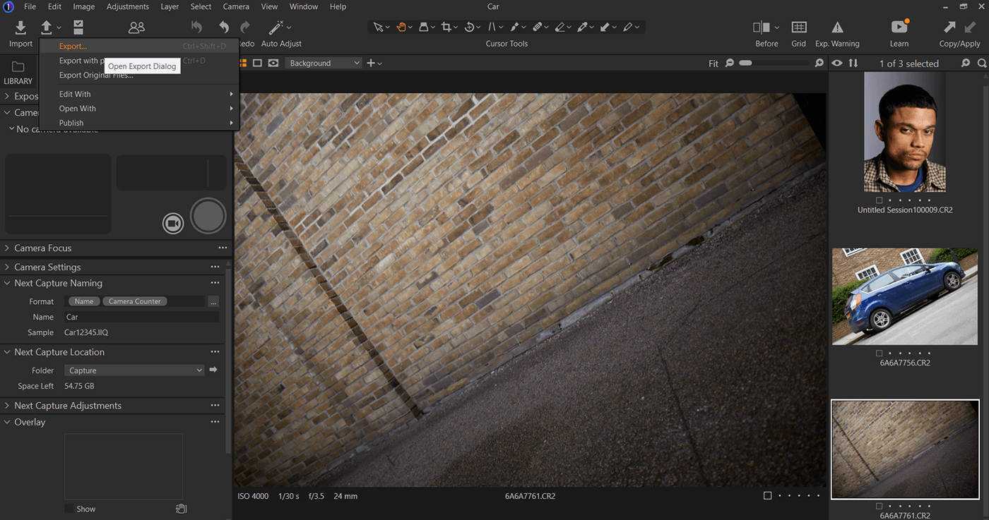
These are the pictures.


This is me exporting the CR2 raw files into Adobe Photoshop at 300 DPI.


This is me masking the car and pasting it onto my background image.


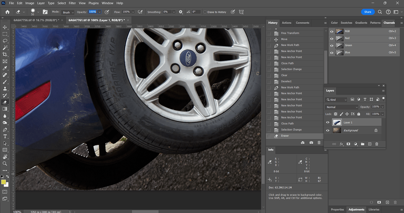


This is me erasing part of the background that was featured in the car image.


This is me darkening both the background and the car so that they fit each other.


This is me increasing the size of the car and darkening it more to fit in with the dark background. I have also given it shadows with the burn tool.


This is me masking the subject's face, pasting it onto the car as a new layer, making a vector mask of their right eye into a new selection and putting it at the head light of the car. I then darken it to fit in with the dark texture of the car.

The reason why I have positioned the car at a high sloping angle as opposed to a straight linear angle is because in automotive photography advertisements, cars are positioned like this as it is seen as heroic as it is similar to climbing a mountain whereas if a car is put straight or at a low sloping angle, it is seen as more unattractive.
However, the car is too big and the shadows with the burn tool don't look as realistic so I decided to improve the image by reducing the size of the car by making the car a smart object so that it does not lose its quality as I move it then going edit>free transform>scale. Then I improved the shadow via selecting the background layer, using the pen tool under the car to make a loop of shadow which I made into a vector mask and then adjusted the level of the darkness the shadow would have.

I then made the background darker again through adjusting the brightness to -50 and contrast to 50.

Afterward, I removed the eye from the picture and put the picture of the subject's image face onto the car again. I decided that this would be for my composite poster and that I want my composite poster idea to be about racing and to advertise a car with the potential to go fast for a movie like fast and furious. This is because none of my ideas before e.g., me wanting to capture a footballer fit into what I really like and wanted and I like racing.
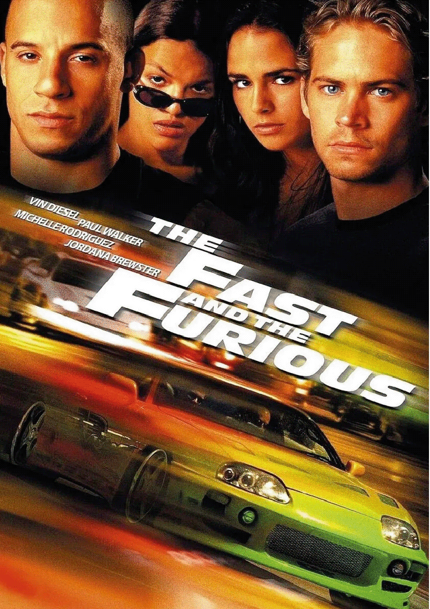
I noticed in many The Fast And The Furious Poster Composites, the car which acts as a primary subject is blurred and given lines to show the movement of its speed. I decided to replicate this idea but in a different way using my subject's face.
I opened the portrait file from capture one, went to Image > Image Rotation > Flip Canvas Horizontal (this is to make the subject face the left as opposed to the right so that it can fit in with the rear end of the car).
I then made the subject into a smart object so I can move it freely without it declining in quality and went Edit > Free Transform to rotate it into the rear end of the car's position where the lights are. However, I wanted it to blend in with the car so I manipulated the opacity of the layer where the subject was placed. I did this by making the layer have the screen overlay and then with the eraser tool brushed out the hard edges of the picture.


As you can see, I have positioned the car's back lights into the nose of the subject and they are semi opaque. I created the same blur effect that The Fast And Furious Composite Posters did by pressing B to select the mixer brush tool and then I gently dragged out all the edges from the bottom of the subject's collar to the top of their ear and stretched it into the car.

Although this looks good, I feel it is missing the 'gazing' effect that cars give in these posters from their head lights. I wanted to create this effect by enhancing the saturation on the subject.
I did this by adding Hue/Saturation via the circle menu.

I downloaded the Antique Olive Std Font which is what The Fast And Furious uses for their movies and input parts of the logo in various different layers so that I can arrange them how I see fit.


I would say that I am very proud of my outcome and it is exactly what I wanted in a composite print. Although there was a change in direction from my original ideas so rapidly through experimenting with making a composite, I still found this successful.

